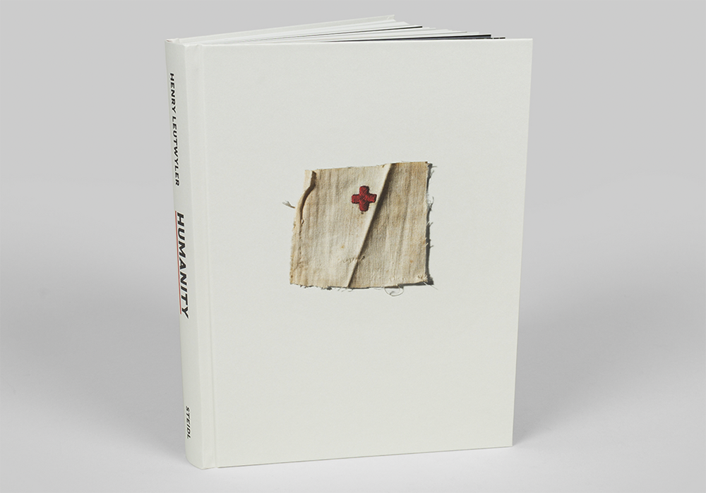
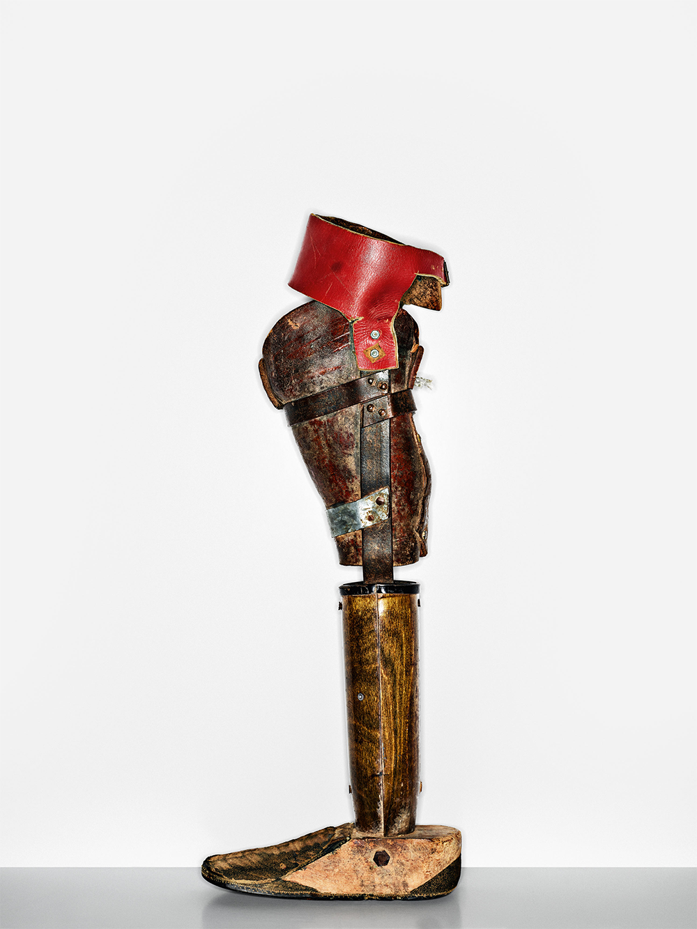
Henry Leutwyler: International Red Cross & Red Crescent Museum is a new book out from Steidl. It is Leutwyler’s meticulous photographic record of some of the nearly 30,000 objects in the International Red Cross and Red Crescent Museum in Geneva. The selection movingly conveys the vital functions of the Red Cross: to provide humanitarian protection and emergency aid, to deliver medical and community support, particularly for the poor and underprivileged. A fellow lover of historical medical ephemera, Jessica Helfand interviewed Henry Leutwyler about the photographs.
Jessica Helfand: Pascal Hufschmid, in his introduction, talks about how (your) photography brought this collection “to life”. Talk to us about how you approached selecting these items, how you paced them for this volume. and how you came to understand the complexity of this material as a singular body of work.
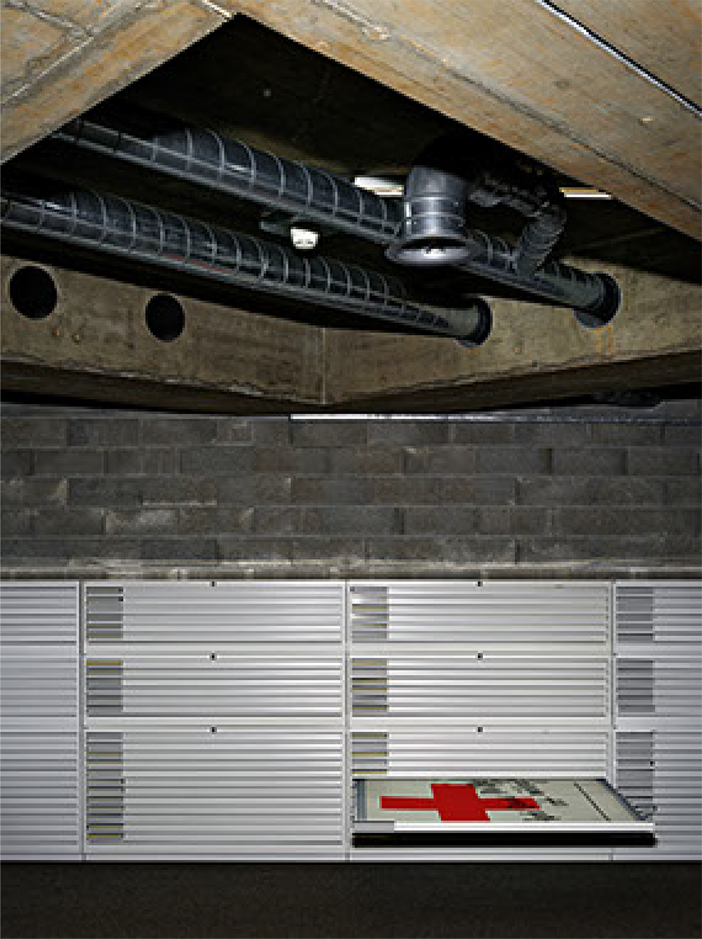
Henry Leutwyler: Let’s assume that the collection of the Red Cross and Red Crescent Museum encompasses 30,000 objects, more or less. The initial goal is to attempt to understand it. The only way to do so is to have full access to every box and every drawer. (Which I got.) I started compiling lists of objects that caught my eye, some clear from the start, while others needed explanations. This museum, by the way, has an enormous poster collection: I looked at every poster, opened every box, touched and looked at every object.
I had been interested in the concept of the Red Cross, for a very long time. I am Swiss: we grow up with that symbol ingrained in our visual memory. I also visited the museum when it opened. I had also read a few books, prior to starting this project, so I guess I had a decent idea from the start.
Images © Henry Leutwyler
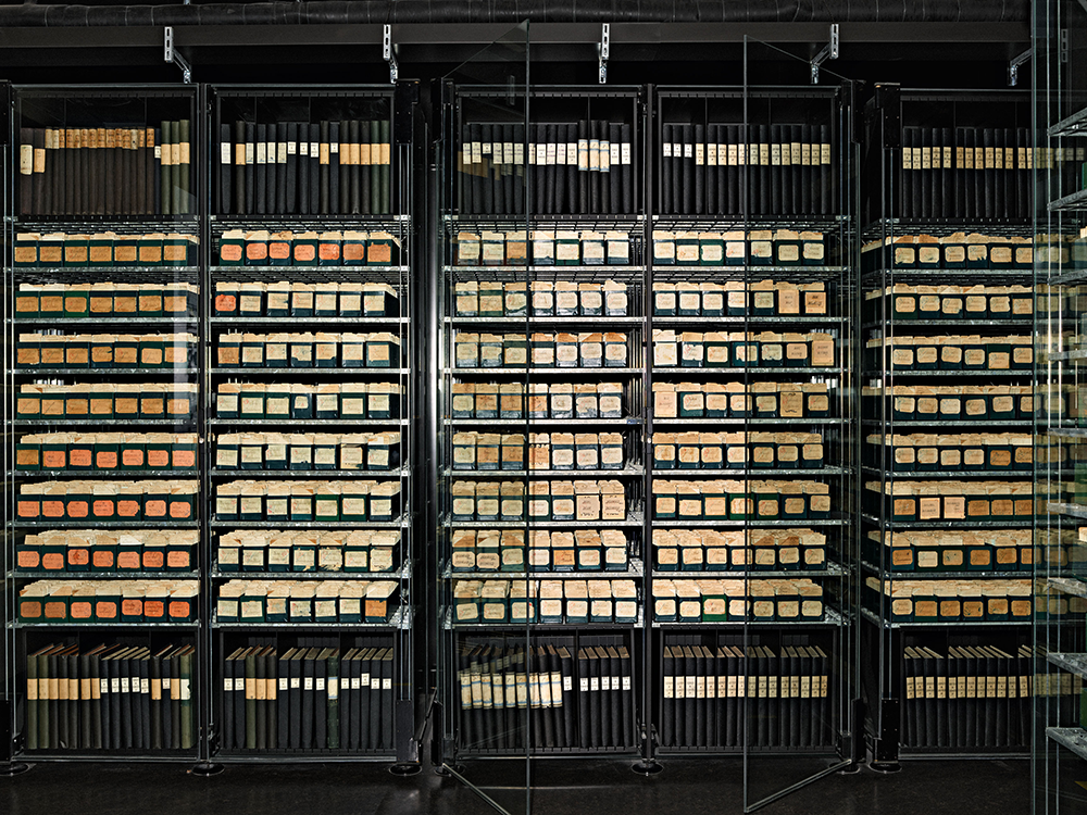
JH: Tools and tags, prostheses and armbands, oxygen tanks, written documentation, even the forms of storage these items take—you consider all of this, and more. What surprised you as you set out to depict the enormity of this subject? How did you make sense of it as a narrative?
HL: As far as selecting images for the book, this was the genius of the designer, Ruba Abu-Nimah. I handed over to her a lot more photographs then the ones that made it into in the book. She made the final selection, designed the book, and sent it for approval to the museum’s director, Pascal Hufschmid. It was a collaborative effort between Pascal, the archivist and designer, and of course Gerhard Steidl, the publisher. A project like this always demands teamwork: I am just the lonely photographer. Without everyone’s help, the book would not exist.
Images © Henry Leutwyler
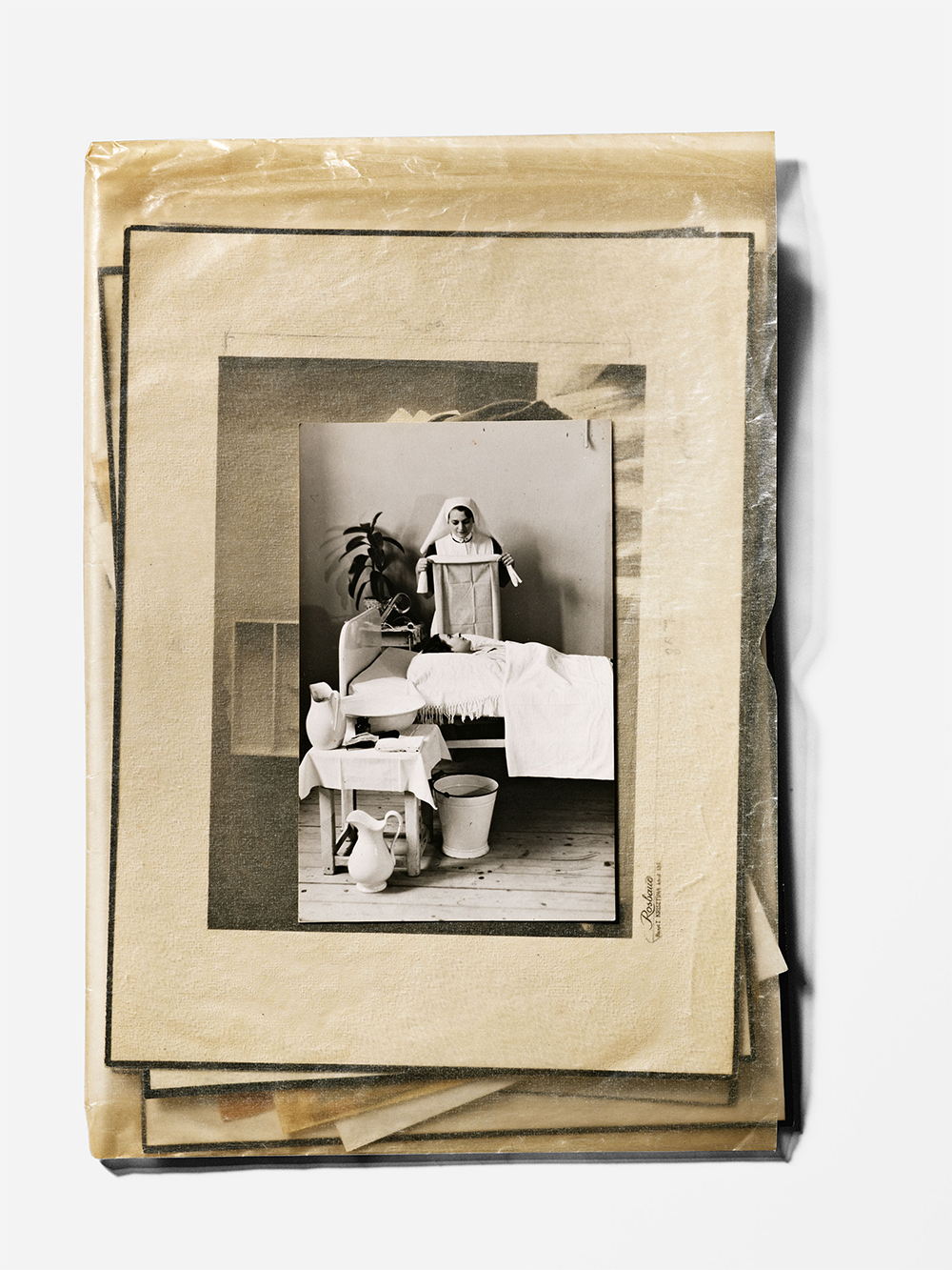
JH: I’m curious about the inclusion of correspondence, in particular those prisoner of war letters—fragile, personal, ephemeral, (and occasionally labeled “urgent”)—knowing as we do now that the transmittal of such documents likely faced enormous obstacles in time, space, and the realities of wartime uncertainty. What drew you to this material, specifically?
HL: Objects tell one story—letters and documents tell another. You need both for the sake of the visual narrative, as well as essays, introductions, and epilogues. I believe a “picture book” is most successful when there is actually something to read. A plethora of information from different points of view is important, hence the inclusion of those letters and correspondence.
Images © Henry Leutwyler
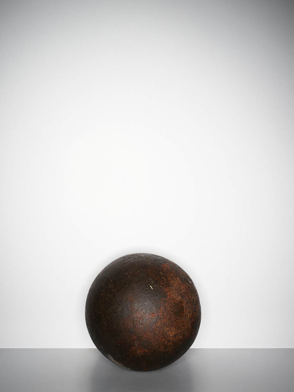
JH: I found myself very moved by the cannonball—a stunning moment of pure geometry amidst multiple layers of visual narrative in this book—believed to have been used during the Battle of Solferino. (For our readers who may want a quick history brush-up: this battle—and in particular Henry Dunant’s 1862 book about it—led to the establishment of the International Committee of the Red Cross, and to the first Geneva Convention in 1864.) Dunant’s manuscript and calling card are featured later on, but the cannonball stands alone. Can you say a bit more?
HL: While I was there, I discovered Henry Dunant’s Bible: the museum wasn’t even aware they had it. This moved me, but what moved me the most, actually, were two other objects: that cannonball recovered by Henri Dunant during the battle of Solferino, and the very first Nobel Peace Prize, which he was awarded in 1901. It was magical to hold this in my hands, even for a brief moment.
JH: If the scale of that cannonball tells one story, the amputated Teddy Bear tells another: a toy with a handicap, that tiny, shortened limb inversely proportionate to the emotional wallop it delivers. Was that your reaction when you came upon it? Was that your intention In sharing it here?
HL: The Teddy Bear, which is amputated, lies somewhere between a toy and an educational object. It is given to kids in war zones, to help them understand the dangers of land mines—another evil, invented by man. Even after the wars end, the mines remain, and keep on killing. What a tragic world we live in, filled with stupidity and greed.
Images © Henry Leutwyler
JH: Our readers, many of whom are graphic designers, may be interested in the posters included here—among them, the 1937 Assassins poster from the Spanish Civil War, Zagorski’s mid-century recruitment poster for the Polish Red Cross, and a 1961 Japanese blood drive poster. Can you tell us what drew you to these selections, and why? Is the graphic depiction of public health part of the story here, and, if so, does the design contribute to what we see and learn and remember? Should it?
HL: I went through every drawer—looking at thousands and thousands of posters—and picking the ones I personally loved. I photographed many more posters, but again, many images had to be cut to make it into the book, and I’m sure the final selection highlights subjects and countries that reflect my own personal interests: I adore Japan, for instance (and had to refrain from photographing every Japanese poster), but I was also drawn to the first poster for the Red Cross and Red Crescent Museum by the Swiss graphic designer Roger Pfund.
My grandfather and father were printers, and I grew up against the background sounds of rumbling Heidlelbergs in Lenzburg, the little village where I grew up in Switzerland. Let me just say here that I LOVE typography. I adore good design, both graphic and industrial, and I love to collaborate with good, passionate designers.
Images © Henry Leutwyler
JH: I am curious if your feeling about the color red grew more nuanced as you went deeper into the collection and into this project. (I might ask the same about the power and persistence of that cross.) Possible?
HL: The connection between the Swiss flag and the Red Cross flag is exceptional. The bright red indeed becomes deeper and deeper, as we discover more and more the sadness and the reality of what humanity (or possibly the tragedy of humanity)—becomes. The world grows darker and darker. We never learn. We may never learn.
JH: In her epilogue, the curator Nathalie Herschdorfer writes about your work bearing witness, speaking to material culture as a form of cultural biography, “Like relics,” she writes, "these objects, painstakingly photographed, bear witness to damaged lives.” Tell us about your own emotional reckoning with this collection, and how you came to think about physical damage, but also about historical, political, even moral damage. If our stories live on in the objects that outlive us, how might books like this one provide a collective record of our own humanity?
HL: As a magazine photographer, I decided not long ago that I should stop waiting for that special project and become my own client. So now, if I have an idea, I try and do it. And see? It works! We are discussing it here, and sharing it with your readers!
The bigger story, though, might look something like this. We are surrounded by visual garbage. The iPhone is a fun invention, but I read a while back that some years ago, within one year, the quantity of images produced equals the quantity—from day one of the invention of photography—until that specific year. Cats. Sunsets. Nudes. What can I say? I suppose I’m just attracted to different images and objects, and I seem, of late, to be increasingly drawn to tragedy. Some years ago I did a photographic essay on the American Civil War for Time and more recently, I did a portfolio—on the occasion of the twenty-year anniversary of 9/11—for National Geographic. Somehow, given these projects, it is not surprising that the Red Cross book came to life.
