One does not typically associate minimalism with designs for the other 99 percent. It is a style, as Thomas de Monchaux wrote a few weekends ago in the Times, that "conjures a life of such intangible ease that the mere creature comforts of visibly abundant stuff are transcended." Or, as Rem Koolhaas put it rather succinctly in last year's Cronocaos exhibition, "Minimalism remains the preferred mode of conspicuous consumption." When a project that is not of the luxury variety is described as "Minimalist," it is typically code meaning cheap, shoddy, and lacking in creativity.
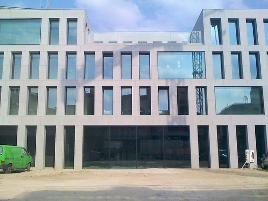
All of which makes the recently opened Antwerp Central Youth Hostel especially rare and admirable. The design is by the local architect Vincent van Duysen, and was supervised by his very capable project director, Kristof Geldmeyer. To simply call it austere is to not do it justice. The facade, with its rhythmic pattern of vertical windows, is proportionally related to its neighbors, and is clad not with concrete (as it may appear in photographs), but familiar Belgian bluestone, an expense the architects justified not only on aesthetic grounds, but for its sustainability. (It will last forever, and requires minimal care.) Most of the windows are deeply inset, to accentuate the building's mass, though large picture windows that shield public spaces are pushed up against the facade. In the evening, video works by the artist Michel Francois are projected onto
these large glass panels, turning them into screens.
Public spaces have a sleek, Death Star vibe to them—but in a good way—with walls and ceilings painted matte black. The living spaces are above, along double-file corridors in a neutral off white. The rooms themselves are well-planned with customized furnishings, and therefore relatively spacious, if ascetic. A couple can take a double room with a private bath, sheets, and breakfast for a combined 53.60 euros. A single night in a dorm-style room is 22.80. Included is Internet usage and bike storage. There's also a bar (but you'll have to buy your own drinks—I recommend a Bolleke).
The success of the project is attributable to numerous factors, but none more important than the evident care taken by the architects, who typically work on the very high end, that the precision of their design was carried through to the end, and not value-engineered into oblivion. It's a credit to them, and blessing for those who would like to experience one of Europe's
design capitals on a tight budget. Whether it is the most beautiful hostel in the world is surely debatable, but there is no doubt it is special. (Feel free to paste alternative favorites in the comments.) A slideshow follows.
Comments [12]
Slide 2: "Recessed windows accentuate mass." Alternate caption: "Impenetrable mass with (seemingly) inoperable windows cannot be breached by a truckload of C4 plastic explosives."
Slide 6: "Dining area with articulated ceiling." Alternate caption: "Space that's neither passageway nor room with ceiling articulated by ghastly fluorescent tubes."
Slide 8: "Lounge space with large window." Alternate caption: "Lounge with very large window provides view to, um, random construction stuff outside." What's with the oddly spaced, surface-mounted, light enclosures that look like beams, or are they beams? In either case, they're wrong.
The there's that gratuitous tree in the sad courtyard. Alternate caption: "Inmates are allowed 20 minutes of supervised fresh-air intake every day."
And yet, I could be wrong. Architectural photography is historically a corrupting and deceptive medium.
03.10.12
12:12
also, take a peek at the super-high approval ranks it gets online--an objective metric from a general public not always inclined to this aesthetic.
03.10.12
01:21
03.11.12
11:55
these comment sections used to be so much more lively. now? is it that people just comment on twitter? does everyone have their own blog? the registration system? are we all too boring? hmmm.
03.12.12
09:42
Alternate caption: "Roof where hostel guests desperate to escape the unrelenting ascetic austerity can gaze out at a nearby historic building and try to imagine what it might be be like to be there."
Given how austere, even desperately bleak, the hostel looks as a result of the admittedly poor iPhone photos, it seems all the more ironic that the architect lives nearby in a "beautiful neoclassical townhouse." Makes me wonder if he would like the severe austerity enough to actually live even one night in it. And, if not, why expect others to do so?
One of the tenets of good communications design is that words and images should work to support one another (and I'd hope for DO to follow that). Here, word and image are at odds. The photos are really poor and they belie what the words claim. For example, why on earth show us the photo of the prison-like entrance gate? Oh, yes, it is stunning in its simple graphic composition of vertical lines (yawn). But it still looks like a prison gate. And if there is something special about it, the photo fails to convey that.
Surely there must be better photos of this hostel. Why not show them to us? If the detailing is indeed excellent, let's see why that is so. If the rooms really are well planned with custom furnishings, let's see a photo that conveys that idea.
03.13.12
12:36
for the record, though the exterior of van duysen's house is neoclassical, the interiors are, in fact, minimal, though it's a private home and not a hostel, so obviously more luxurious. it is unfair to suggest he does not have the courage of his convictions.
as for the gate, is a side entrance, not the primary one. it was not there as a demonstration of my picturesque photo skills, but to show that even the side gate had been designed with care in the spirit of the rest of the project. i guess it looks prisonlike, if you want to see it that way. it is a security gate. enough said.
anyway, i will try to be more judicious about posting comments in the future (as i try to be generally), so as not to render undermine my own enthusiasms.
03.13.12
01:56
03.13.12
02:34
i try to post decent photography here. sometimes it is my own, when there is no alternative, and it's not always perfect. to the extent that this is about my experience, i don't think that's unreasonable.
but i will say this, we arch critics are often assailed for not reviewing projects in their early stages, and then presenting them ONLY in the stylized photography that is generally paid for by the architects themselves, and otherwise does not present a realistic vision of a building or place. (though, of course, all images are mediated.) so i think it's wrong to expect only professional quality photography, especially here. again, to the extent that the images here undermined the points i was trying to make, that's my bad, but if the argument is that we should only have perfect professional shots, i think you're dead wrong. we should show things how they appear. this is a web site about design, after all.
03.13.12
04:39
Maybe my expectations of photo quality on DO were too high. It makes me wonder this: Does the fact that it is a blog mean that one can get away with lower-quality imagery? If you were publishing a book about this, would you use these images? If I was designing the book for you, I sure would want to try to get better images, and I feel the same about the blog.
Incidentally, I agree: We should certainly see things as they are. The highly stylized photos in AD often seem ridiculous--so unreal. But highly-stylized photography is not necessarily good photography, nor does good photography always have to be highly stylized.
03.13.12
05:15
03.13.12
06:16
Also, as an aside, I always thought DO was much more than a blog. I thought it was trying to be a leading outlet for, and proponent of, excellence in design criticism.
03.13.12
09:22
Not sure whether to read this as tongue in cheek or not "i deserved what i got for my somewhat cynical seo title."
Additionally, while maybe not "beautiful" there is a refined dormitory feel going on. I have stayed at uglier/more rustic hostels.
03.30.12
08:04