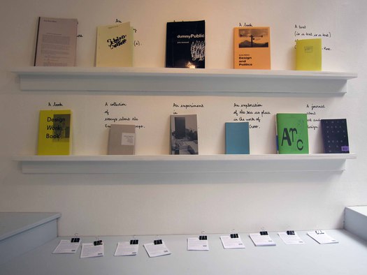
Part of the Critical Writing in Art & Design display at the Royal College of Art degree show, London, 2012. From What Does Critical Writing Look Like?.
When does a picture solidify a news story, and when does it merely sensationalize it? Does typography tell part of the story—or all of it? How does design reinforce—or refute—a journalist’s rhetoric? And if you can’t judge a book by its cover, what about a magazine? Over the course of the last twenty years, we’ve looked at the truncated narrative rhythms of Twitter, unpacked nineteenth century satire in France, climbed Ramparts, skewered Malcolm Gladwell, heralded critical writing, interviewed journalists (and investigative journalists), interviewed editors (and designers-turned-editors), analyzed subversive comics, critiqued newspaper redesigns, shared reflections on Gonzo Journalism and wondered if seeing really was believing. (We’re still wondering.) The real challenge for design writing now, founding editor Rick Poynor wrote back in 2004, is to move outwards into a world in which design is everywhere.

