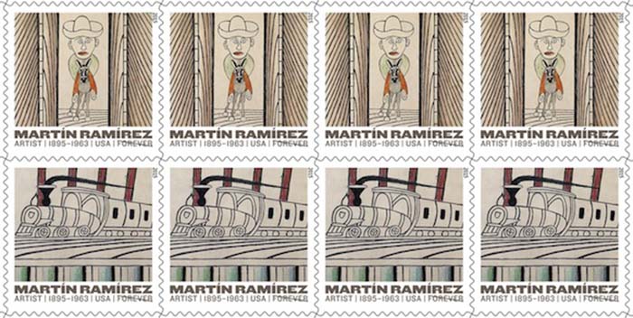
On March 26, the US Postal Service commemorated the work of outsider artist Martín Ramírez by issuing five of his drawings on a new set of "Forever" stamps.
Mexican-born Ramírez spent more than thirty years in US psychiatric hospitals, during which time he created a remarkable body of work characterized by repeating lines, idiosyncratic motifs, and daring perspective.
Ramírez’s art blends the emotional and physical landscapes of his life in Mexico with the modern popular culture of the United States. Although he worked mostly outside the art world in his lifetime, Ramírez is recognized today as one of the great artists of the twentieth century. He was born in 1895 in a rural community in Guadalajara, and died in a psychiatric hospital in northern California in 1963.
John Foster interviews designer Antonio Alcalá of Studio A, who designed the Ramírez stamp in his role as an art director for the USPS.

++
John Foster: I see that your firm has designed quite a few stamps for the United States Postal Service. How did this project come about?
Antonio Alcala: The United States Postal Service, to their credit, attempts to put forth a stamp program every year that represents the best of America. Anniversaries of important events and presidents are reoccurring subjects. But USPS balances these with stamps about the arts, sports, literature, and other themes that show the rich diversity of our nation. The subjects of the stamps are selected by the Citizens Stamp Advisory Committee, often times from subjects nominated by the public. In this case, the selection of Martín Ramírez brings forward an under-recognized Latino artistic genius to the American public. As for my role, I'm under contract to work as an art director for the USPS stamp program. There are three other art directors, and together with the USPS staff, we design all the postage stamps. I was assigned this particular subject, in part because of my interest in outsider art and familiarity with Ramírez's work.
JF: There are five different stamps with five different themes—imagery that Ramírez used in different ways throughout his life. There is a botanical stamp; a caballero; a train; the stag deer; and a marvelous architectural one with a tunnel. How were these themes selected?
AA: At the beginning of the assignment there were no particular restrictions. It was hoped that this sheet would fit in with others produced by USPS honoring great artists like Alexander Calder, Isamu Noguchi, Louise Nevelson, and Romare Bearden. I immersed myself in anything I could find about Ramírez and his work. We have a great team of researchers who provided me with many books and articles. Eventually, we made contact with the Ricco/Maresca Gallery, who represents his estate and could provide us with images.
Ramírez's work is often large scale and stamps, of course, are not. Additionally, Ramírez often crafted his art surface out of several pieces of paper leading to irregularly shaped drawings. I quickly discovered it would be difficult to reproduce entire works, communicate his artistic genius, and have a design that worked as a stamp. I spent a great deal of time looking through his work, exploring various crops to highlight imagery that communicates his genius, works well as an individual stamp, and also within a group of four other stamps.
The selections needed to feel like equivalents yet not be repetitive. As is the case with so many design assignments, much of the work involves editing and making decisions about what to retain and what to discard.
JF: How many artworks by Ramírez were you allowed to select from? Were these pieces from museums or did any come from private collections?
AA: There are, I think, 450 artworks in existence. Although it feels like I looked through them all, it probably was more like a half or a quarter of the total. There are many rights and permissions issues USPS needs to work through with every stamp issue, and this restricted my options a bit, but not in a harmful way.
JF: It must have been some small agony for you not only selecting which art work to use but how to crop a great work of art for maximum appeal.
AA: I can't say I feel entirely comfortable cropping an artist's work. In doing so, I am basically changing the artist's vision or intention. I do a lot of work with great art museums including the National Gallery of Art, the National Portrait Gallery, and others. For all those clients, when I crop an artwork, I make sure to show the full piece elsewhere in the product. In this case, I couldn't. But I'm hoping the stamps will entice people to look up the originals, and the rest of Ramírez's incredible creations.
JF: I see you used a sans serif font called Knockout Full Heavyweight. Tell us about this choice for the stamp.
AA: Knockout carries a bit of a vernacular tone that works well with Ramírez's work. It's also a well-crafted font, with a whole slew of companion weights that make it easy to combine into a tight little lock-up at the bottom of the stamp.
There's a lot of information there, but it manages to quietly compliment the artwork.


Comments [1]
03.27.15
02:10